
The day was a particularly gray and dark day which affects the quality of light of the museum's galleries, something I did not really notice in the morning because I was so intent on correcting the drawing aspect of the painting. It was only when I came back from lunch did the difference really seem aparent to me. Each painting in the gallery has a spotlight that has a warm tint to it, where the easels are solely reliant on the natural light that filters into the galleries via the skylights above. This difference in light quality was affecting my ability to get color and value accuracy because the light on the painting was so different than the light on my canvas.
Here is a photo taken just after lunch with my painting on the easel and the original on the wall.
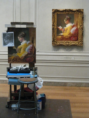
{middle of day status - with different light qualities}
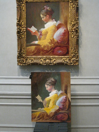
Here is another photo where I set my painting under the original painting to compare color and value differences. See the light ground behind the pillow, how different it is on the easel versus when propped up under the original painting, while working on this painting I also need to work on adjusting for this shift in color temperature also.
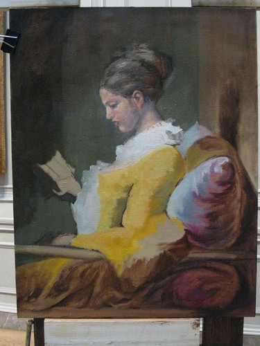
{middle of day status - with the same light quality}
So my time spent after lunch was a combination of getting the drawing correct while also adjusting the color and values some.
Tomorrow I return to the NGA, Monday is my regular day to paint, so hopefully it will be a bright and sunny day to warm up the natural light some. I need to work on the structure of the head some more and will hopefully be able to move on to other parts of the painting as well.
{end of day status}
4 comments:
So interesting! Thanks for sharing!
i just bumped into your blog, and im also doing a replica of this painting, i was wondering what colors are you using?
Thanks Virginia :)
Welcome Kim! I am using a partially time appropriate palette with some modern colors for some blue subsitutes for the blues that were available when Fragonard was painting but difficult to locate now days...
The colors I have are:
Ivory Black
Raw Umber (really like this one for this painting)
Burnt Umber
Ultramarine Blue
Cobalt Blue
Viridian
Terra Verte
Chromium oxide
Gamboge (only Old Holland sell the true pigment of this)
Indian Yellow
Naples Yellow
Yellow Ochre
Burnt Sienna
Cad Scarlet (modern color and used very sparingly)
Venetian Red
Perm. Alizerin Crimson
Cremnitz White (by Old Holland)
Zink Buff White (by Williamsburg)
I have been told you could also use Terra Rosa, I just have not added it to my palette and I like how venetian red mixes with the other colors...
I hope this helps and good luck on your copy!
Post a Comment